About
Space India
Space India Builders & Developers has a uniquely diverse multi-domain portfolio that covers real estate marketing, property development & property consultancy services. Our ongoing projects in Panvel near the railway station include 1 RK, 1 BHK, and 2 BHK flats for sale in Panvel. These new residential flat projects are extended across several locations in and outskirts of Navi Mumbai, covering peripherals towns like Panvel, Neral, Karjat, etc. We cater to clients from both budget housing and upmarket perspective & proudly claim 12000+ happy customers & growing. Our full spectrum of housing and real estate property for sale near Navi Mumbai includes flats 1 RK, 1, 2BHK residential flats in Panvel; all located in mini & mega townships of Panvel, Neral, Karjat.


Core Values &
Mission
Opportunities are like shooting stars they present themselves all the time. Just look up into the night sky and you will see one right in front of your eyes. Shooting stars occur even during the day but are hidden by sunlight.
Success comes to those who are perseverant and patient enough to spot them in the night sky. However, greater success comes to those who are dynamic and innovative enough to see these opportunities in the brightness of the day and make the most of them. Space India’s philosophy adheres to the belief that the impossible can be thought, acted upon, and eventually achieved. Seeing Shooting Stars during the day is just the very beginning of Space India’s dynamic endeavor.
Our mission is fueled by an attitude of viewing every challenge as an opportunity worth its weight in Gold not just for us, but for countless families looking to realize their most cherished dream; that of finding their very own ‘Jannat’ in the Maya Nagari of opportunities; Navi Mumbai.

Client Testimonials
KALPAK DALAL
Prakriti Sparsh, Excellent View, and infrastructure, One of the best I have seen yet. The project is well planned and I would like to appreciate the Sales team and Miss. Prachiti for supporting us to understand the project.
Apurva Bavishi
I met Mr. Ravindra at the Khopoli Site Very Nicely explained all the details and helped me with the decision I am happy with the Professional response
Hitesh Koli
Visited Panvel office of space India. I had a fantastic and heartily welcome. Nice and affordable projects with transparency. Mrs. Prachiti Zemse guided for the exact affordable required flat. Thanks for your cooperation and guidance. Space India is a place where you can go without the hassle and without fear for a good deal so Booking is done by Sparsh.
Nilesh More
Thanks to Tejal 😊 I had booked a flat at Panvel and really like location and society it gives appreciation to Tejal because she guided with the right attitude and behavior. I was 15 days followed her and she always replies to me immediately with satisfaction I think she is perfect place work she always sees customers need not space products and sales always gone through needs base not a product base.
Prathamesh Shahasane
I had an amazing experience with Space India. I will rate them 5 stars. The staff is skilled and Cooperative. Always ready to help. Clear all your doubts. Ms. Prachiti guided us in an extraordinary manner. They maintain good customer relations.
Balkrishna Garud
The staff is skilled and Cooperative. Always ready to help. Clear all your doubts. Miss. Akshaya guided us in an extraordinary manner. They maintain good customer relationships, suggested many alternate options, thanks for the wonderful service. I will rate them 5 stars.
Ongoing Projects
Space World
1,4 BHK | Neral
Space Gold Crest
1 BHK | Neral
Anant Residency
1,2 BHK | Panvel
Primrose
1 BHK | Panvel
Space Greens, Dundre
1,2 BHK | Panvel
Amulyam
1,2 BHK | Panvel
Ananda
1,2 BHK | Panvel
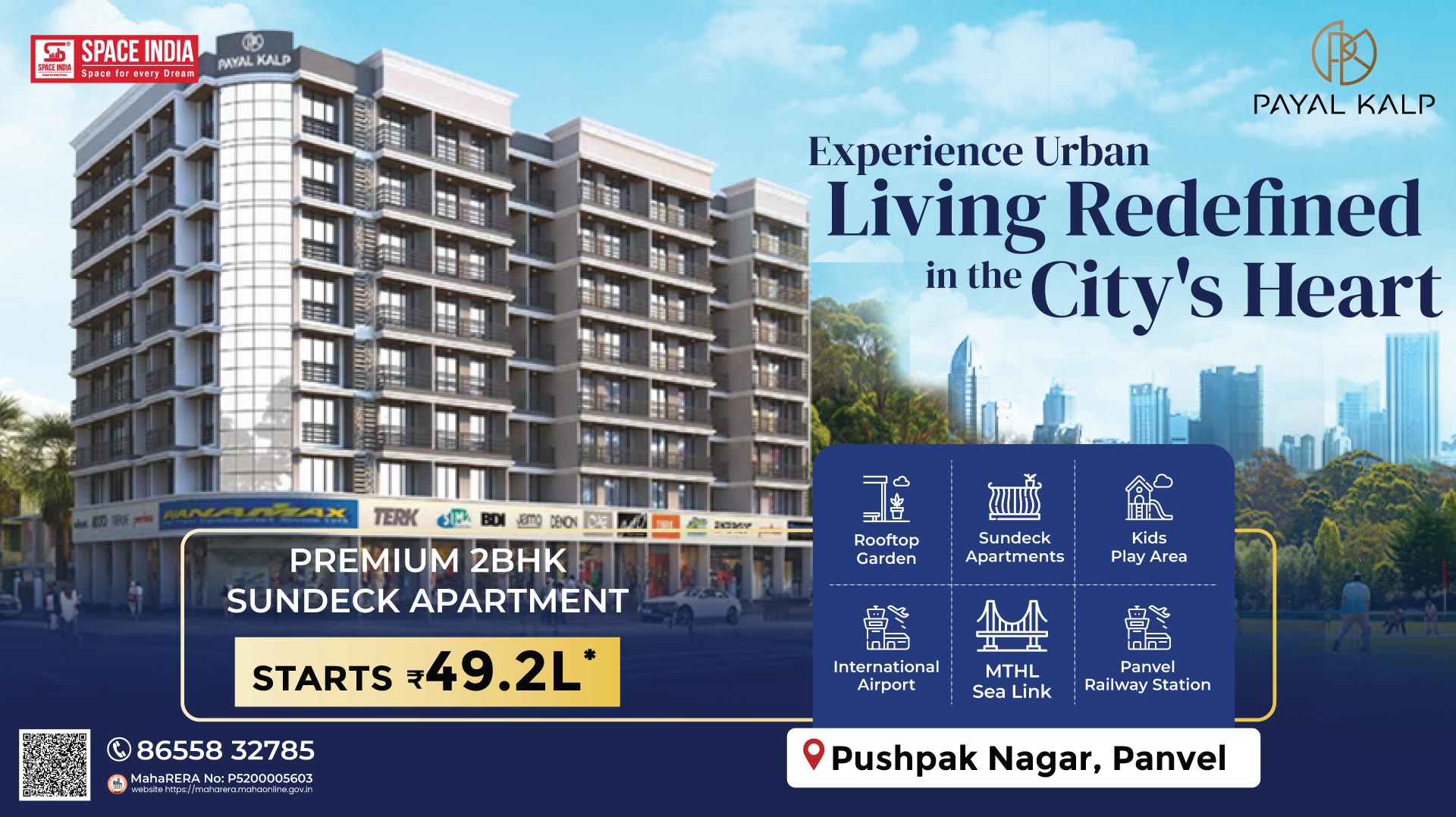
Payal Kalp
1,2 BHK | pushpak-nagar,-panvel
Kartikya Vatika
1 BHK | Panvel
Aikyam
1,2,3 BHK | upper-kharghar


